From Dan’s response (“I saw the redesign,” pause, “I just need to get used to it.”), I’m guessing that nobody’s writing home about the new layout. But the previous layout had too many small things that bugged me, like the photography section previous/next navigation not working. Which really had nothing to do with the layout itself now that I think about it. But the CSS file was really disorganized. This one can probably use some cleanup, but it’s organized much better. Which also doesn’t have too much to do with the layout itself. Just account it to boredom.
I thought it might be interesting to look at drawings from last week before (and some during) converting the ideas to HTML/CSS. This is the first time that I went from drawings to code, skipping Photoshop (partly inspired by the 37signals “Why we skip Photoshop”).
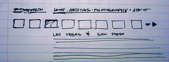
This is the original idea. Which was preserved for the most part. The black splotches to the right of the thumbnails are supposed to be arrows. The idea was that you could click right and left to make the thumbnails scroll to look at older ones. When actually trying to do it, I decided it wasn’t worth the trouble of finding a script, trying to figure out how it works, then formatting it. The novelty would wear off fairly quick, and that’s what the photography section is for.
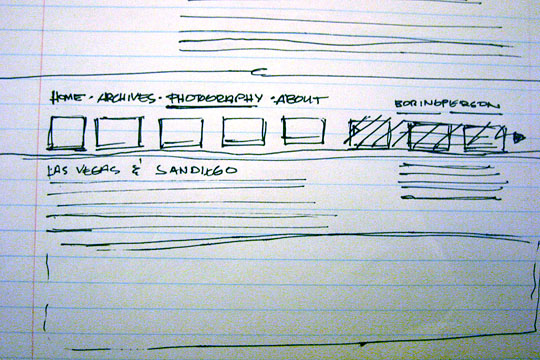
This one moves the content to the left side and the title to the right, like was and like it currently is. I crossed out some thumbnails so that they would only go as far as the content would go. There are lines of text below the title, which I think was supposed to be a Twitter update. I still want to stick the Twitter update somewhere on the site, maybe just in the footer, but first I need to figure out how to do that without using their badge or a WordPress widget.
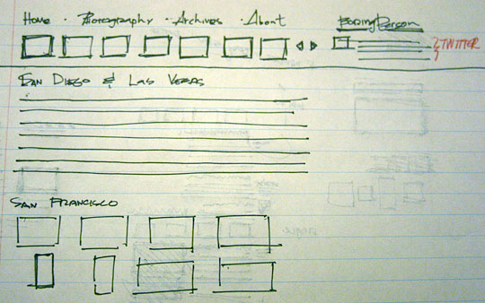
This one still has the arrows, and the same idea with the Twitter feed below the title. As far as I remember, I was thinking about what content would show up on the index, because I wanted photography updates to show up in some fashion on the front page. This one has them as thumbnails, and I was planning on having a Lightbox gallery on the front page, but then you could click the link to see all the images on one page. But I decided to pick one or the other, since having both would mean I’d have to think of both formats when editing pictures for the site, which is already cumbersome enough.
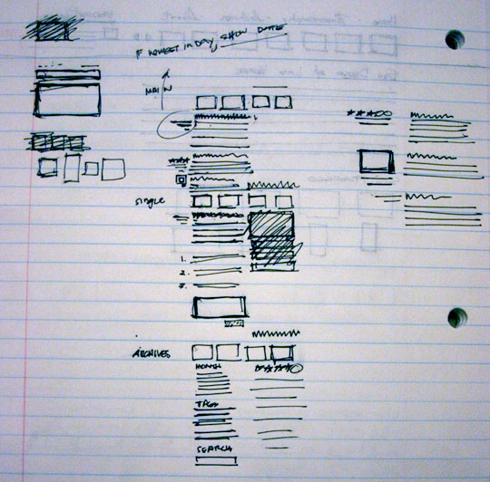
At this point, I was thinking of what each section will look like. Main is the main page. Single is what you go to when you click the title or the comment link. Archives is the archives page. I did the separation because that’s essentially how the WordPress files are setup (main.php, single.php, and archives.php) to start with, along with a few others. The right side is more thinking of the different types of posts on the main page (top to bottom: reviews, photos, general). The writing at the top says, “If newest in day, show date.” The idea is that the date would only be shown once for each individual day, but I decided that the dates help separate each post nicely.
I’m not exactly sure what I was going for here, but I think I might have been considering captions showing up below pictures that appear on the right side of a post. I think it might still be a possibility.
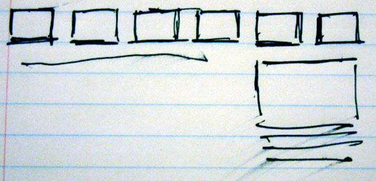
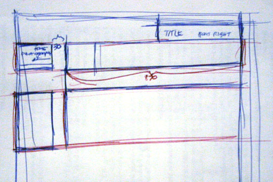
I drew this right before I started writing the code. I had the general idea, but I needed to plan the div organization. Red ink indicates floating divs in larger containers.
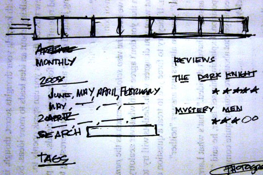
I was thinking about the archives section here. I wanted a list of years with the months showing up below in a paragraph. Given the choice, I’d choose that, so I might change it in the future once I have time to figure it out. Credit where credit’s due, this was inspired heavily by the kottke.org archives. I stuck the search in the footer, since it’s fairly useful if you know where it is. It was either scroll to the bottom every time or scroll up and click the archives link every time. One’s not much better than the other, but I went with the footer.
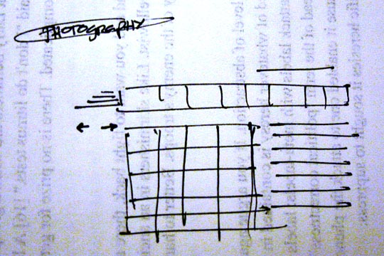
Here’s the thumbnail grid, which I’m fairly happy with. It was sort of a pain to code, but I got to refresh my minimal knowledge of PHP, so it was sort of fun.
Clean was what I was going for, and I like what came out. I guess this wasn’t the most riveting subject in the world, but I like to keep some kind of record when I make a big change to the site. Previously: 2004, 2005.